|
inferno by Guideline [web]
[nfo]
|
||||||||||||||
|---|---|---|---|---|---|---|---|---|---|---|---|---|---|---|

|
|
|||||||||||||
|
popularity : 54% |
|||||||||||||
alltime top: #17039 |
|
|||||||||||||
|
||||||||||||||
| added on the 2006-12-30 13:17:30 by TheBat |
||||||||||||||
popularity helper
comments
the graphics and music are like two friends that haven't seen each other for decades. and shamelessly slow at some parts.
And I have yet to figure out whether it tries to be funky or gay :)
The problem is that it tries to be both and more and explodes in mid air, tearing itself apart.
oh yeah um the thumb I mentioned.
Yay.
nice! kinda weird prod..
hmm.. one of the scenes with the buildings looked great, unlike the rest
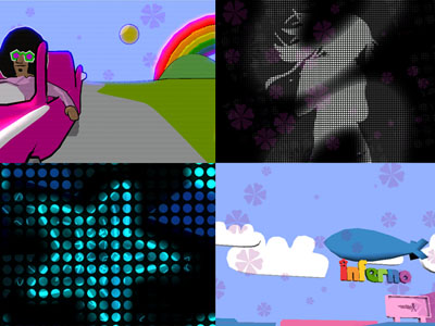
You gotta love the illuminated sun in the driving scene. Bring back the shadow too guys :)
Truck: Disco Inferno?
Crashed my Windows in an exceptionally spectacular way (froze when the zeppelin arrived, then I managed to get the task manager displayed, after which the screen started updating some parts with screwed up and blinking blue visuals from the demo). Maybe I need better drivers..
Managed to crash my computer too. Bluescreen ftw. Worked well on a second attempt.
An incoherent mashup of things from which some look quite cool, some looks quite bad. Awful soundtrack though.
An incoherent mashup of things from which some look quite cool, some looks quite bad. Awful soundtrack though.
nice!
"The Application failed to initilize properly (0xc0000135)"
FHAAAK!! Fix it....im on AMD3800+ 6600GT 128Mb
FHAAAK!! Fix it....im on AMD3800+ 6600GT 128Mb
you guys are really getting better :)
looks pretty nice, but I didn't like the music.
Should have been made solely out of those "cellshading" like graphics. Very nice style and funny.
Umph....
Nice!
This production went from "piggy" to "sucks" because of 2 things:
1) The music - come on! Do you have ears? (Kinda makes me sad that you didn't ask me to do the music, hehe)
2) The greetings part was impossible to read? Those signs are just flying by on my system. No time to read what's actually written there.
Uhm, no - sorry - can't do it - no no..... no.... better luck next time, I guess.
it's cool. technologically demazing but nice design and warm fuzzy feelings and such.. i liked the greetings for instance. a big improvement from previous guideline prods in my eyes.
cute :)
too long, but has something
funky and weirdly enjoyable despite being a mixed bag of thrown together mismatched scenes. the music really didnt help though.
submit changes
if this prod is a fake, some info is false or the download link is broken,
do not post about it in the comments, it will get lost.
instead, click here !

There is one effect that made me go "why the HELL haven't I thought of that before" so thumb for that. Other than that, it's fairly tame (: