|
R>V>LV>R by Ümlaüt Design [web]
[nfo]
|
||||||||||||||
|---|---|---|---|---|---|---|---|---|---|---|---|---|---|---|

|
|
|||||||||||||
|
popularity : 63% |
|||||||||||||
alltime top: #3438 |
|
|||||||||||||
|
||||||||||||||
| added on the 2022-06-12 13:47:20 by Gargaj |
||||||||||||||
popularity helper
comments
sound!
WOW, I got serious FLT vibes watching this. The soundwork is ace!
also, who needs a capture? this runs super smooth in wqhd on my 1060 so everybody with windows and a gfx card should be able to enjoy it in realtime.
also, who needs a capture? this runs super smooth in wqhd on my 1060 so everybody with windows and a gfx card should be able to enjoy it in realtime.
Short and sweet!
Nice
so so
Got some late early zeros ('08 - '09) vibes from this. It runs pretty smoothly here as well! Good work code wise and overall Garg! :)
hm. i am not so sure what to think. it feels a bit empty for me but that might be the approach/goal. especially when going the minimalistic route colors are always a thing, because the ones one does not like pop more :D but i l dig the music and the sync flashing of the bg colors/elements which gives it a nice touch. way better than some plain strobo all over the place. i still waited for a fat drop into some breakbeat or something ;) overall not your best prod but still better than a piggie :)
"better than a piggie", the new "nice" ;)
Great third place. :)
The usual ÜD quality :) A deserved victory. Oh and the music is mind blowing.
Very nice had to stop playing the youtube capture and run the executable so good.
nice but short
Neat and tasty
I really like it. It could have been A true killer with a decent 3D model.
yeah, looks like a broken rebels demo, so, piggie it is
Nice skeler'esque hardwave track, camera is decent enough too, but the actual visuals ...
Does it spell revolver?
I havent watched it yet. Thumb up or down to come later
Thumb up for the particles man
Nice!
Dark and heavy and perfect for a walk where you become one with the night - If ears could wear cool leather jackets, this is what it'd sound like.
But what I like the most about it is how all the pieces, especially those that got left out, actually tell a whole story that goes way beyond the screen time - and that's what makes the difference.
But what I like the most about it is how all the pieces, especially those that got left out, actually tell a whole story that goes way beyond the screen time - and that's what makes the difference.
visually lofi, unfortunately in all the wrong ways
cool lil track though!
cool lil track though!
gut!
Cool idea and epic lorn-ish track, but the artifacts were a bit much. Just seemed a bit unfinished.
Honestly this is one of my favorite demos so far. It's simple, the music just gives you that WOOOOW effect. Fell in love with it. I really liked the minimalism and simple shapes made of kind of neon lights. Thank you for bringing this to qb :)
Nice mood!
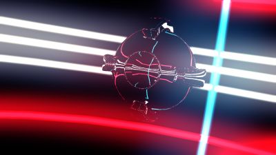
Nice use of reflections to "paint" shapes (though, I wish it had at least 4x supersampling since it "runs super smooth" on a 1060). I really have a thing against mesh explosions when they don't apply any rotation to the pieces though.
artifacts were a bit annoying, music ruled though and solid pace.
I'm with noby on this one
Yep
the parts I prefer are the ones in black, red and white
Yeah, what noby said. Absolutely great track, and I do like myself some minimalist visuals, but it would have been so easy to make it look way cleaner that it's a bit annoying. Like, more than 256² pixels for that cubemap, blurring it a bit (you can sell that as "look, PBR" :D), generating mipmaps for it to fix the aliasing at grazing angles, turning on AA for the main target, having a less band-y blur, and choosing a softer tonemapping curve / adjusting the glare intensity to make it look a bit less early-2000s additive (because it isn't!). Each of those would probably really have helped.
(yeah, I ran it through RenderDoc to see what might be the issue, sorry ;) )
(yeah, I ran it through RenderDoc to see what might be the issue, sorry ;) )
great ambiance
Nice.
Really great one!
little global illumination stuff would make it even better?
man, this is so complete! I love it
Nice, I like it!
Is there some sort of message or just random stuff ?
yeah
(especially: great work on the soundtrack)
(especially: great work on the soundtrack)
beautiful!
nice
The music is... magnificent. And the rest is as if taken straight out of the elite mid 00's 64K scene. Which is not a bad thing. Its like candytron with less candy and more bass.
Lovely, especially the music.
cool
powerslave stuff
PWR>SLV so to say
great music!
<3
Oh very cool. The darker more abstract scenes especially are impressive.
omg that track <3
lists containing this prod
submit changes
if this prod is a fake, some info is false or the download link is broken,
do not post about it in the comments, it will get lost.
instead, click here !

Love the soundtrack.