|
Haunted by Loonies [web]
[nfo]
|
||||||||||||||
|---|---|---|---|---|---|---|---|---|---|---|---|---|---|---|

|
|
|||||||||||||
|
popularity : 62% |
|||||||||||||
alltime top: #3509 |
|
|||||||||||||
| added on the 2019-04-21 23:48:17 by Psycho |
||||||||||||||
popularity helper
comments
Not at sofa, but probably at partyplace someone jumpscared. Good.
rulez added on the 2019-04-21 23:51:04 by Serpent 
Scary shit
Like in a ghosthouse or hunter mansion
Goal reached? :)
Like in a ghosthouse or hunter mansion
Goal reached? :)
I totally enjoyed that one!
Scary trip of awesomeness :)
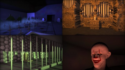
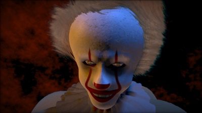
excellent idea, great execution. too much of an IT reference, but still, does it well :)
the concept works well, and the amazing amount of content makes you forget it's not the demo compo :)
I really loved that one, lots of content and really well done. A lot of real life haunted houses could get some inspiration from it :)
Please do a final with proper sound syncing and a little more sophisticated/contrasty lighting
Please do a final with proper sound syncing and a little more sophisticated/contrasty lighting
Absolutely great!
Very, very fun to watch!
Great idea with quite a lot of content! Also the excellent soundtrack really enhance the experience!
This is great, very entertaining 8k, loved it on the bigscreen.
great direction
...what Raft said
themed and well executed. nice!
Absolutely loved this during the compo. The scene with the organ is brilliant. This is how you fill 8k, properly.
It scares me the most that I recognize that evil clown’s features from somewhere. Is it only me? :) i have met him before
Amazing guys! Good thing that Punqtured did not spoil anything when I was asking for more info while buying some beer. Because it made me jump out of my chair xD
I love the theme and lighting is done quite nice! The audio is amazing! I love the stereo separation in there as well :-)
I love the theme and lighting is done quite nice! The audio is amazing! I love the stereo separation in there as well :-)
Amazing work. But maybe a bit too scary!!
Lovely concept and execution, jumped twice during the compo even though of course I was expecting *something* to happen... :D
And thanks Punqtured for explaining the sound architecture!
And thanks Punqtured for explaining the sound architecture!
That kind of atmosphere... I like!
Funny concept and good execution.
nice one!
I'm a bit torn about this because as a technical achievement it's great, and it holds your attention just fine. At the same time it's not exactly easy on the eyes and ears for the most part.
Can I see an another fov 8k in next Revision?
Great concept and great cameras but also what Gargaj said.
this is one of those 8Ks where you think 'nice that they did all that in 8K' but aesthetically, well.. the size limit certainly chewed away there
Quite eyecancerish but funny and a deserved winner. Yes, at least at the Jumalauta lounge (2nd screen) we got jump scared a few times :)
Deserved winner. Hope to see you guys next year again!
Miles ahead of the competition. Loonies continues to show how much more potential there is for 8k intros.
Lots of content for such a small nice. And it really scares me =O
good
Innovative concept well done. Scary!
Quote:
excellent idea, great execution. too much of an IT reference, but still, does it well :)
This. Truly glad you guys keep pushing the limits of storytelling in 8ks.
Very enjoyable tiny intro!
I want to go on this ride
:)
Good one
@Maali: That's exactly my "problem" with size coding.
However: I appreciate the technical achievement and tbh, I very much enjoyed the atmosphere and direction.
However: I appreciate the technical achievement and tbh, I very much enjoyed the atmosphere and direction.
Quote:
but aesthetically, well.. the size limit certainly chewed away there
I might be wrong here (and I hope I'll be corrected if I am), but I don't think they could not find any more room for size optimization; after all, it hardly pushes new boundaries on the amount of content or, say, geometric complexity, or post-processing. Feels more like they were rather short on time and/or did not have any concrete plans to improve it further. But more than that I think the demo wouldn't necessarily be better off if it were on the visual level of that Dying Stars clown head model. The stunted visuals actually help the campy feel imo.
.
.
.
.
.
BOO!!!
.
.
.
.
BOO!!!
More jump scares than an actual haunted house roller coaster I went on last summer
Boo, indeed!
8Kb? Amazing work!
8Kb? Amazing work!
it's beauty lies in the idea.
this is what hauntellus waitus lurks like


don't like horrors, but this is The Thing! :)
that was fun during the compo!
Great!
I keep forgetting that it is 8k, however I do agree some with Gargaj on this one.
Still a deserved winner.
I keep forgetting that it is 8k, however I do agree some with Gargaj on this one.
Still a deserved winner.
Great idea, nice execution, very cool direction!
A haunted house instead of a ski trip this year
scary <3
Strange.
submit changes
if this prod is a fake, some info is false or the download link is broken,
do not post about it in the comments, it will get lost.
instead, click here !
