|
CLUB ASM by Dekadence [web]
[nfo]
|
||||||||||||||||
|---|---|---|---|---|---|---|---|---|---|---|---|---|---|---|---|---|

|
|
|||||||||||||||
|
popularity : 62% |
|||||||||||||||
alltime top: #3704 |
||||||||||||||||
|
||||||||||||||||
| added on the 2019-04-21 20:38:36 by ricky martin |
||||||||||||||||
popularity helper
comments
great style!
rulez added on the 2019-04-21 21:25:00 by Asato 
Beginning was awesome, but the latter part wasn't really my taste.
Very stylish.
Love it.
The style just works perfectly all the way.
Arial FTW!
The style just works perfectly all the way.
Arial FTW!
Had style :)
sync
My compo favorite!
I'm a sucker for super slick 2d and this totally delivers. Music is wicked too. Nice to meet you at the party Ricky. Keep em coming.
The best Assembly invitation since can't even remember when. Rm keeps delivering, never stop the madness!
so cool!
I love the distinctive style you've developed, and it just keeps getting more refined and slick all the time. Definitely should have been in the top 3. Damn!
Nice typographic work!
usually i hate this sort of ugly-on-purpose hipster style that has invaded all posters etc. in the past 2-3 years - but it's cool to see it being acted out in a demo production. after all, scene has always reflected current design trends, and it was about time that this one gets a demo treatment as well. plus, it fits the platform well. so, a cool thing all in all - with a marvellous sountrack and great synch!
Yes
It rocks! Thank you so much for doing this! <3
2nd best demo in the compo.
I love this. Should have placed higher.
Best thing in the compo. Shame it lost the name voting compo.
This is like among the top-5 releases of the entire party. Super awesome track and so many inventive motion typography ideas. Also it's an invite that doesn't feel forced or tacked on!
Great variation on text-effects. Clean style.
Cool invitation (despite the font :D in 1:02->). We are definitely comign now!
Nice Assembly has an invite this year on an iPhone
had its visual moments but overall not my cup of tea.
I am not sure how I feel about this. I think I get what you were trying to do with this style but it felt... a little fake, I guess? Like you were trying to make it look obviously-low-effort but inadvertently put in a tad more effort than needed, betraying your goal. And this clicked the wrong way in my brain, because now I keep thinking how it would look if you were putting all your effort and expertise into something not built around irony.
Quote:
@wullon: minor correction, the demo uses Inter, not Arial :)
Oopsy. It works well :).
Hey, what is with the font bashing? Inter is a pretty rich font and coincidentally we also used it for the subtitles in our Revision demo.
This demo is a bit of a mixed bag for me. It shows a typographic approach to demos, which I happen to really like and hope to see more of. I do think however the type treatments are a bit dry -nothing really bangs or shows friction.
This demo is a bit of a mixed bag for me. It shows a typographic approach to demos, which I happen to really like and hope to see more of. I do think however the type treatments are a bit dry -nothing really bangs or shows friction.
I love motion design <3
not really what I prefer
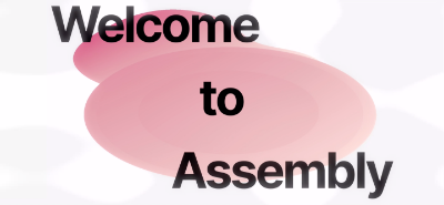
the part in the screenshot is the one I like the least
beside that, well executed
the part in the screenshot is the one I like the least
beside that, well executed
this was really refreshing to watch, great sync, stylish and just over-all entertaining.
more pls!
more pls!
Super stylish.
An invitation to the glorious Assembly written in ... swift.
Weak OK.
Weak OK.
One of the highlights of the party for me. Great design and sync!
Enjoyed this, lots of nice motion design, but like a few others above I didn't really like the screenshot scene.
loved it.
Great music, design and sync. Super slick invitation.
Design!
What stingray said.
That was different.
Coolness. Fresh and creative
Oh, I've missed this one! Indeed totally fresh with a lot of funny and creative touches!
pretty cool!
The part in the screenshot is the _only_ part of the demo where the Aria..sorry, Inter style doesn't work for me; it looks too cheap. That said, what a great and stylish demo, taking text animation to the next level!
Fresh! (Also what dojoe said)
love the graphic design
lovely music, syncing, style.
i'm a sucker for this stuff.
i'm a sucker for this stuff.
lists containing this prod
submit changes
if this prod is a fake, some info is false or the download link is broken,
do not post about it in the comments, it will get lost.
instead, click here !
