|
Aten Hotep by Brain Control [web]
[nfo]
|
||||||||||||||
|---|---|---|---|---|---|---|---|---|---|---|---|---|---|---|

|
|
|||||||||||||
|
popularity : 60% |
|||||||||||||
alltime top: #6257 |
|
|||||||||||||
| added on the 2019-04-20 21:28:32 by Pap |
||||||||||||||
popularity helper
comments
This must be work of an enemy 「STAND」
It s good to see you back. Nicely done for dead guys
legends never die.
I have missed you guys! Welcome back :)
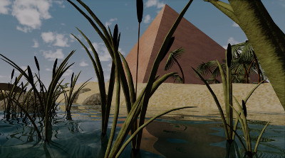
The intro feels slightly weird. On one hand there's a lot of good in it (the water looks nice, I like the colors, the theme itself is pretty cool), on the other hand I don't understand what's happening, it feels very "computer graphicy" in a sterile way and the 90's French demoscene flashbacks I get from the design is a mixed bag. And the ending feels really clumsy to me.
Still, I quite liked it. With a bit of more refinement it would've really gone to places.
♥
solid
Very nice, was highly enjoyable to watch!
i kinda liked the last few seconds visually
What preacher said and kudos to you guys for getting your asses up and doing stuff!
The Egyptian theme is very interesting and the water refractions are pretty damn realistic. Glad to have you back.
Really well executed. Great prod!
Atonists? Some good looking things there + egypt equals thumb up.
impressive buildup and visuals. Nice.
Welcome back :)
It started as a really great 64kB. I really loved the first minute: good Egyptian theme, good rendering, models, and textures. I liked the 2D art (hieroglyphs and the flying objects).
But after that, you ran out of ideas and the demo doesn't live to expectations. The scenario is missing. The camera moves and the editing become uninspired. Even the music (which was very successful in setting the mood) doesn't know how to continue.
You obviously have great tools and a lot of talent. I know how difficult it can be to find time (and making a 64kB requires a lot of it!). Maybe it would be better to do something a bit less ambitious, but more polished.
In any case, it's a lot of good work. Well done!
it is a nice 2019 rendition of a 1998 flyby
Very nice! I expected cannons in the pyramid, though.
Nice to see you back guys! Hope to see something more in the future!
Outside it's better than inside, but overall I'm just happy to see you back in action!
does not look bad, but it was not my cup of tea.
what Maali and Preacher said
nice! def reminds me of early 2000s demos exploring 3d scenes. lots of cool content packed in here
Looks sadly a bit rushed.
Okay
Quote:
However, given the constant impacts of real life, this is what we could make out of the limited time that we managed to steal from our born and yet unborn nextgen. Things are not getting easier in the future, so our motivation is to properly announce the facts, but with an as-proper-as-possible release of the stuff we've been implementing over the past years.
Achievement unlocked.
This is a tricky one because on the surface of it there's nothing "wrong" with it, but it also feels like an intro from a bygone age where the visuals are there, the music is there, the theme is there, but it never really connects, there isn't a "woo that's slickly done" moment, which is a shame because clearly the assets were there. Still, there's a decent chunk of quality effort in there and it's nice that it tries to go big.
I'm gonna take the final statement with a grain of salt still ;)
I'm gonna take the final statement with a grain of salt still ;)
i liked the water at the end but it didn't make up for how sluggish the whole presentation was. you need better pacing and subtlety.
Very nice!
It has some gaps, but at least it doesn't look like random geometric vomit with some random electronic music. thumb up.
submit changes
if this prod is a fake, some info is false or the download link is broken,
do not post about it in the comments, it will get lost.
instead, click here !
