|
Blu Sky by Scoopex [web]
[nfo]
|
||||||||||||||
|---|---|---|---|---|---|---|---|---|---|---|---|---|---|---|

|
|
|||||||||||||
|
popularity : 65% |
|||||||||||||
alltime top: #2994 |
|
|||||||||||||
| added on the 2015-08-26 20:51:58 by Photon |
||||||||||||||
popularity helper
comments
A bit random, but looks lovely and good code for only one week of work! I'd love to see something longer and/or more polished from you. :)
Man, when this demo started it almost gave me the goosebumps at the party. This one has some of the classic Scoopex kickass ambience, but sadly is too short to be a killer.
Hm, started out cool but doesn't seem like a real demo. I like the fact that it seems to be trackloaded though :)
I get a guru on my A1200/030 and also in WinUAE with both AGA and ECS configs, will wait for final :)
bit short and ugly gfx for scoopex
Enjoyed it!
Excellent.
it rockx!
it rockx!
Waiting for that final version (and hoping that your sine scroller will actually scroll)
This gave me oldskool-Scoopex feelings.
I heard some rumours that Photon was going to release something that he spend some time on at Gerp. Given my therefore high expectations I was initially rather disappointed when I saw it, however, no after re-watching it is indeed rather nice albeit short. As others have said, there is something special about the ambience of it.
That beginning alone deserves a thumb!
Great intro, yet a bit too short :)
quality music
If Photon produce this while he is pissed, I wonder what he will produce if he in rage! Nice gfx and tune btw.
a bit short. but nice tune and good visuals. but silverhawks approve so thumbs up ;)
Okayish.
too short
The additional content in the final version is worth a thumb up. Cool code as always from Photon, but the design and music are not quite there.
Short but sweet :)
Final version capture here
Final version capture here
Not bad. Nice to see Karpow is still around.
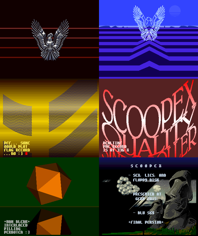
Nice, especially the vector eagle
I liked it on stream, but also waited for the final. It's still a bit short, but now I like it even more. Good stuff!
I really enjoyed the final version. Thumbs up and good work!
Cute one. Especially Screenshot.
Yeah! Great final, way to go Scoopex!
Great code, good demo and music.
nice but far too short, but still good to see a release from you.
Final version is great!! :)
Mildly cute, but the design sucks and the pace drags. Soundtrack sounds like the worst kind of trash from 1991.
Simple but nice production which has its moments - mostly due to the nice music.
...
The final version = Thumb!
Hey, that's not rubber! ;)
Wonderful!
yes!!!!
Looks like some imbecile who can't code a shit had a try to make a demo in 1993.
gfx and music are decent tho.
gfx and music are decent tho.
(somewhere in space, a burst of static breaks the eery silence)
*qrrrssk*
What was that, Commander?!
Oh don't worry, it's just the Russian speccymafia mothership or whatever
*qrrrssk*
What was that, Commander?!
Oh don't worry, it's just the Russian speccymafia mothership or whatever
Code seems hurried a bit while music and gfx are above par.
Keep em coming! Rangerism isnt dead yet ! ;)
starts off super nice, then loses some temper. overall this is really cool!
nice..
nice one!
Nice oldskool style with some fx-explanations. I like it.
boring
Photon.
More than boring...
Missed this one. Good enough, if too hasty made that shows.
ok
I find that this demo is in the purest Amiga style. And it is oniric for me.
Missing thumb.
Very very cool!!! Thanks for making this.
Apparently, I am not shrewd enough to grasp the ingenuity; maybe
some more background information would be helpful for experiencing a
revelation :-)
some more background information would be helpful for experiencing a
revelation :-)
Didn't knew this production, but reminds me of a lot of other demos from the past.
It's actually quite nice for a fast-made demo.
I like it.
Yes!
Rewatched it after a longer time. Strong opening! Moreover, I buy the
fullscreen (vertically filled?) sine text. I also like "poor people" fillers
(catchword: HAM vectors). But I do not understand the sweep pyramid;
some more objects would have been nice. And what does "VME" stand
for (perhaps a silly question?)? Anyway, appealing music and gfx.
fullscreen (vertically filled?) sine text. I also like "poor people" fillers
(catchword: HAM vectors). But I do not understand the sweep pyramid;
some more objects would have been nice. And what does "VME" stand
for (perhaps a silly question?)? Anyway, appealing music and gfx.
Cool release and I really dig the logo!
Good effects but presented a bit random.
submit changes
if this prod is a fake, some info is false or the download link is broken,
do not post about it in the comments, it will get lost.
instead, click here !
