|
blue fusion by Sensenstahl [web]
[nfo]
|
||||||||||||||
|---|---|---|---|---|---|---|---|---|---|---|---|---|---|---|

|
|
|||||||||||||
|
popularity : 55% |
|||||||||||||
alltime top: #10872 |
|
|||||||||||||
|
||||||||||||||
| added on the 2013-10-19 23:54:37 by sensenstahl |
||||||||||||||
popularity helper
comments
Bytes well used!
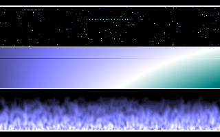
I like this. Three oldschool effects in one screen. Like the pallete.
tight code.
first byte intro i see with a parted screens!
The effects in this were probably better than in the actual 64k intros...
three effects *and* a nonsucky colorscheme... that's already more than I would expect in 256 bytes.
Additionally, it rocks.
Additionally, it rocks.
Nicely done! :)
sensenstahl !
Just add some text and you have a decent 256byte cracktro :D
Nice palette and nice (even though simple) effects make a really nice 256 bytes intro.
nice.
Sensenstahl intros also have something special to them, no exceptions here. The fire also looks very neat.
That is so awesome! :) big up!
proper
i know it doesnt fit but this needs a scroller in the middle =)
great work for 256b
great work for 256b
i enjoyed =) great work :)
Stylish.
Forgot to thumb up this beauty. All it needs now is a scroller and a kickin' chiptune :P. That's some neat design in 256b!
Lovely, Design++.
Great idea in putting more than one (two ;) efx in to. Very, very nice, goot color-scheme (nice to see that the fire is not, once again, red...) pleasant to watch.
Squeezing the most of your bytes! <3
yes
Großartig.
Impressive!
submit changes
if this prod is a fake, some info is false or the download link is broken,
do not post about it in the comments, it will get lost.
instead, click here !
