|
GrandPa by adinpsz [web]
[nfo]
|
||||||||||||||
|---|---|---|---|---|---|---|---|---|---|---|---|---|---|---|

|
|
|||||||||||||
|
popularity : 55% |
|||||||||||||
alltime top: #12405 |
|
|||||||||||||
| added on the 2013-07-07 01:45:05 by wullon |
||||||||||||||
popularity helper
comments
nice
rulez added on the 2013-07-07 01:49:57 by Queen_Luna 
Great!
cool.
Here's a first thumb for the party version that was really nice. My only "gripe" is that the first part with the graffiti fell disconnected with the rest.
I'll watch the final and the source code ASAP. See you at the 1k competition next year ;)
I'll watch the final and the source code ASAP. See you at the 1k competition next year ;)
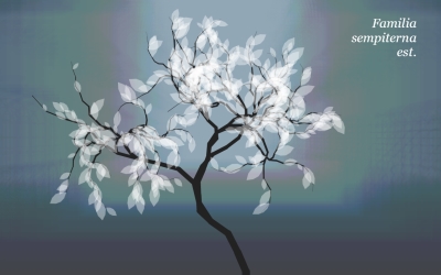
The street part still gets me, it looks so damn beautiful. Relaxing music, and the wonderful tree at the end <3
However the graffiti part would maybe fit more, if it'd look like those tags are on a wall (or a door) - so they'd look like streetart and thus leading into the street scene.
Lovely one! =)
However the graffiti part would maybe fit more, if it'd look like those tags are on a wall (or a door) - so they'd look like streetart and thus leading into the street scene.
Lovely one! =)
I really love the athmosphere :)
great
This is awesome :D
wullon: I saw the "bricks" during the compo but still, the graffiti style clashes with the Medieval-ish style of the houses, and the use of Latin text.
I'd say good usage of emotion
def. carries a soothing mood and has a lot of style.
a little too short/simplistic for my taste, but that doesnt stop it from getting a well deserved thumb.
a little too short/simplistic for my taste, but that doesnt stop it from getting a well deserved thumb.
Love it!
Very well done! Loved the atmosphere - especially the 3D-from-2D feeling in the street part. Also nice to see a demo making use of SoundBox :)
great work
One of the best JS demo i've seen for now.
very nice =)
Great mood.
submit changes
if this prod is a fake, some info is false or the download link is broken,
do not post about it in the comments, it will get lost.
instead, click here !
