|
fr-058: disintegrates by Farbrausch [web]
[nfo]
|
||||||||||||||
|---|---|---|---|---|---|---|---|---|---|---|---|---|---|---|

|
|
|||||||||||||
|
popularity : 69% |
|||||||||||||
alltime top: #3819 |
|
|||||||||||||
| added on the 2007-07-23 20:44:46 by ltk_tscc |
||||||||||||||
popularity helper
comments
Schon wieder so ein hartnäckiges ambient demo...
added on the 2007-07-23 20:45:12 by ltk_tscc 
OPHH:. A FARBRAUCH DEMO:. I WILL SERIOUSLY THUIMB THIS DOWN IF IT IS NOT BETTER THAN DEBRIS AND FR-25 COMBINED., HOW CAN YOU DARE TO RELEASE A WORSER DEMO!!
Thumb down for not being better then debris and fr-25.
at least this had less of the graphical glitches of 828...
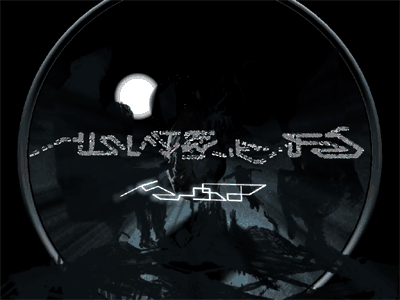
Its ok, the last scene with the moon was nice.
Rest was seen and heard before.
Rest was seen and heard before.
As an ambient demo I liked it. I like the last scene closing too..
Last scene saves the piggie.
Overall: boring.
Overall: boring.
again.
booooooring.
and btw
i really prefer fr-045: life after. ;)
booooooring.
and btw
Quote:
sounds like the very annoying version of a nice Jari Pitkanen track.
i really prefer fr-045: life after. ;)
i didn't catch the message of this one.
yeah
unlike the latest visualice demos i could actually see what was happening this time, and it looked pretty good
well, please, you have proven that fr can't make ambient demos pretty well, now we have enough evidence, so you can stop producing them.
1. Nice for a inbetween release
2. Cool that FR supported a spanish party
3. This is exactly why pouet is destroying the scene with some of the remarks above and below mine..
4. Thump up!
2. Cool that FR supported a spanish party
3. This is exactly why pouet is destroying the scene with some of the remarks above and below mine..
4. Thump up!
I like it. I like how things are synced, even if it is not so much, it is subtile, imo.
cool! I like that final overlay. I wish that the rest of the scene was a little bit more fuzzy too. Less sharp edges and infinitely thin additive shells. I like the way the objects appear out of nothing in the beginning.
Very "gothic", not so bad.
That would be Dali depresed. Although, I don't think any art could benefit of pixelated-ish stuff, it really ruins a bit the art guys :/
It's like letting the technology control your art, not good.
It's like letting the technology control your art, not good.
ja nee
(if it's not there, try again a few hours later when the unet mirrors all have it)
short, looks like an intro to a demo, not a fulll one. Too bad, it's a very cool intro...
I like it too, guess it's not for everyone
I was in a mood to watch this.
I'm a fan of this stuff, too bad the trilogy ends here.. but this is definitely the climax.
Quite Boring, nothing new.. "music" made my ears bleed.
ps killed farbrausch again! \o/
didnt really fancy it sorry :)
didnt really fancy it sorry :)
catchy
yes. nice athmo-spheres (oh my god, wordplay of the year :/)
Interesting.
straight from the assembly line

y*a*w*n

y*a*w*n

Same old ugly and boring stuff, it was about time to end that creepy trilogy :(
which demos are in this trilogy?
anyway, shorter than 828, otherwise completely indistinguishable.
anyway, shorter than 828, otherwise completely indistinguishable.
I enjoyed it. Damn fairlightesc unreadable text!
it has some nice ideas but feels disjointed
last effect is great so thumb
last effect is great so thumb
Yet another crap FR after a stunning one
The visuals and the sound makes a perfect mix which I really like! It's shorter and therefore doesn't come near the feelings that was in 828 so I hope that Visualice and PS will be back with more and make a longer demo for Assembly ( I hope that Fiver2 has made a demo for Assembly aswell! :D )
Although this demo is not my cup of tea it's worth a thumb up as it is definitely well crafted!
It's a very nice scene with an extremely smooth integration between the soundtrack and the visuals. The sense is too deep for me but i love the atmosphere, and the soundtrack also fits perfectly, so thumbs up!
sound and visuals fit
in order to get all the details it has to be watched twice at least
(oh and, it is a bit short imho :D)
in order to get all the details it has to be watched twice at least
(oh and, it is a bit short imho :D)
*yawn*
no
good!
boring ........
With head, heart and hand.
nice but I liked few things
Nice atmosphere.
nice like all the other visu&ps stuff <3
*yawn*
Spooooky! :)
Like the atmosphere.. too short, though.
I give it eight sucky stars out of nine sucky stars, good job!
I found this pretty cool
The idea is really good, but please not another noise demo! Visualice, bring Radix, Jazz or Melwyn back into your demos.
makrokosmos :D
quite nice.. nice flow and all but something was missing.. thumbs up for ace tune and first scene.
I really like the visuals but I think it's time for something new. We have seen enough Odyssey parts.
+++++
I didn't liked the music, but overall idea was really cool, and the merge with the moon is very good too (in my opinion), so... +2 -1 = +1! :D
atmosphere! and yes, i DIG the music!
boring...
Watched a bunch of demos this morning. There were more effects packed into this than all the others put together.
Whining about using dark ambient music in a demo that has dark ambient visuals and atmosphere is somewhat equal to arguing in internet (retarded, that is).
As for the demo itself, being said it's end of the series undeniable comparison goes against 828 and tells me it's nowhere close to its predecessor. Then again I'm happy this wasn't a replicate but a whole own story itself. Have to watch this again when it's time for full moon.
As for the demo itself, being said it's end of the series undeniable comparison goes against 828 and tells me it's nowhere close to its predecessor. Then again I'm happy this wasn't a replicate but a whole own story itself. Have to watch this again when it's time for full moon.
Short, yet it has a great atmosphere. Nice blending between 2D and 3D graphics too.
i don't like this one (definitively not my cup of tea)
Zzzzzzzz. Sorry, dozed off. What did you say?
nah...
soooo booring
What music? Nice visual anyway.
okayish, but time for something different :)
Piggy from me. It's not that it sucks, it just seems I don't like this kind of demos - cheers FR
the first minute was nice but then ..
holy god. werkkzeug is an amazing piece of software. hats off fr.
at last here's the expectable vote.
not my style but found it polished
The stupid blurring/flashing makes it unwatchable.
Not a terribly rich experience, but not bad either.
kai, sure you didn't mean momentum (fr-059) with this? because i don't really see how your description applies to this demo :)
( )
no
excellent but not as good as 828. :)
what nosfe said :)
creepy, 828 is better.
Boring.
to short and just to wierd :P
it's not noisy enough!
The idea is cool and everything and the colors are just right, and the music fits, but ultimately it gets a little boring. But A for effort!
Boring.
socks
:)
This is the style that I like :D.
Whoa, a visualice demo between 828 and 02:22 and I missed it?! WANT! ...downloading now :D
Hmm.. not sure on this one. It's short compared to the others, and maybe doesn't get the same atmosphere. I'll watch it a few more times and see what comes.
Short, but captivating.
nice
Not one of visualice's best but I did enjoy it.
submit changes
if this prod is a fake, some info is false or the download link is broken,
do not post about it in the comments, it will get lost.
instead, click here !
