|
p351 by kosmoplovci [web] & Minimalartifact [web]
[nfo]
|
||||||||||||||
|---|---|---|---|---|---|---|---|---|---|---|---|---|---|---|

|
|
|||||||||||||
|
popularity : 57% |
|||||||||||||
alltime top: #13156 |
|
|||||||||||||
| added on the 2005-11-08 00:12:50 by psenough |
||||||||||||||
popularity helper
comments
nice experience, however, imho, i think i needs more work, te beginning is cool, some parts, the visual doesn't really fit :/ thx 4 that anyway.
rulez added on the 2005-11-08 00:50:14 by mrdoob 
btw, somehow reminds me this one
well if you like dark ambient and so on, this is rather nice.
lovely
The music is ok, but without some mind altering drugs, this is nothing for me.
not bad
Way too long, i couldn't help pressing esc after 10 mins...
But otherwise it would be ok.
But otherwise it would be ok.
Not since fit&bandwagon, or the golden days of farbrausch/haujobb collaborations (circa. fr-034), have I felt as excited to see such an apt venture of artistic groups. But at the same time, I know what the likes of big names can do to influence one's opinion of demo regardless of the product; so i was keen to watch this with critical eye.
On first impressions, my first instinct was a feeling that - despite the personnel - p351 conveyed much more of a minimalartifect style - reminding me much more of
http://www.pouet.net/prod.php?which=12087
http://www.pouet.net/prod.php?which=11035
than that of traditional kosmoplovci.
Said in aesthetic light: this feels much more like a product of abstraction art than that of minimalism (no pun intended).
But of course, that is all artistic kudos, because what we have here is certainly something interesting and enjoyable.
A progressive soundtrack sets us up for a voyage which - by the opening minute or so - we can tell is not going to be a paint-dry sort of demo. Rather, we are venturing into somewhat of an overtone montage in slow-motion; an audioscape of textures and bizarre harmonics changes to keep things moving.
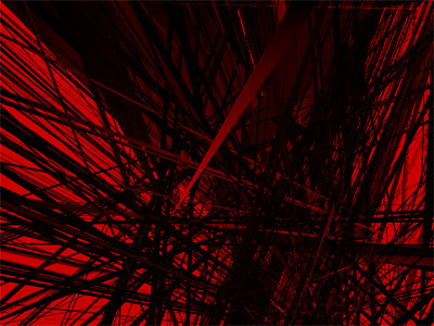
As the demo continues into minutes; i felt less of the previous MA design-influence. A world of divisions, of that 'urban scaffolding' line style vision. I must admit I felt myself longing for a change in visual composition: and when finially we were introduced with blackness, there was a moment in there of real excellence.
Screen divisions at this point also made for pleasantries.. but still i couldn't help feeling that there was something wrong with the climax to this point.. maybe it could have been more gradual; or perhaps more exploited.
But nonetheless the demo keeps rolling on, more harmonics greet some changing textures - including a rather lovely 4/3 solid rectangle which works quite well.
It ends somewhat abruply but still within the same scope of the whole demo..
In short i think it probably isn't either gorup's coup de cour (imho, I guess at perhaps a little more work on concept/cross group collaboration?) - but nonetheless - the product is big, it sounds and looks good - a thumbup and certainly worth keeping.
good one! the 2 kosmoplovci releases at BCN were quite cool, even if they made the compo a bit boring
art style.
good music.
however, too long.
good music.
however, too long.
again
i liked the music and the visuals were ok in the first two, three minutes then i started to expect more variation. but nice anyhow
they will be better if more speedy
now I can show to my friends, what is 4-th plateu looks like =)
didn't like this :( sorry
:)
saw+heard this one yesterday at friend home... he was complete "WFT is that???" and "but this is for real or is the 3d card bugging like hell???"... but we liked the ambient soundtrack...
As I said to ps, I really like the concept behind it. Although it could need more work.
whoa. someone please tell me why did my heart beat just faster and faster...
2-3 fps for ~10 minutes :/
seriously guys, this had potential, and the music could've been amazing but it just didnt go anywhere, it had no progression with the visuals... i want something like d796 - maybe less length but more impact.
seriously guys, this had potential, and the music could've been amazing but it just didnt go anywhere, it had no progression with the visuals... i want something like d796 - maybe less length but more impact.
Very sweet, but I missed some sort of climax or at least a more intense progression throughout the entire piece.
nice atmosphere. very relaxing
too slow..
i've not seen what's on thumnail
(perhaps because i escape after 30 boring seconds of boring visuals with no sound)
(perhaps because i escape after 30 boring seconds of boring visuals with no sound)
ahh
rand(chimera);
just ugly
left me cold
submit changes
if this prod is a fake, some info is false or the download link is broken,
do not post about it in the comments, it will get lost.
instead, click here !
